- 半導体事業HOME
- マクニカの製品・サービス
-
技術情報

-
イベント・セミナー
- 取扱メーカー
- サポート
- お問い合わせ
- 製品購入はこちら
- 半導体事業のメルマガ登録
![]()
![]() 条件を指定して絞り込む
条件を指定して絞り込む
現在2143件がヒットしています。check

[NVIDIA DGX Sparkで試すAIペルソナマーケティング]
第1話 デモの概要
第2話 調査対象の抽出
第3話 質問の生成
第4話 回答の生成と収集
第5話 調査結果の可視化
第6話 まとめ
本話の内容
最後に、回答結果を解析します。解析については、あまり深く踏み込まず、結果の可視化に留めます。
回答結果の読み出し
第4話で保存した回答結果JSONファイルから以下のとおりデータを読み出します。
import os
import glob
import json
from ipywidgets import Dropdown
from IPython.display import display
from collections import Counter, OrderedDict
import matplotlib.pyplot as plt
from survey import SurveyResponseList, Survey
# 日本語フォントを設定
import matplotlib
matplotlib.rc('font', family='Noto Sans CJK JP')
# 調査結果を保存しているJSONファイルをリストアップして、ドロップダウンメニューに表示する
# ファイル名にタイムスタンプが入っているため、最近編集されたファイルが上に来るようにソートする
sheet_list = sorted(glob.glob(os.path.join(".", "response*.json")), reverse=True)
sheet_dict = {os.path.splitext(os.path.basename(f))[0]: f for f in sheet_list}
dropdown_widget = Dropdown(
options=sheet_dict,
description="Survey File:"
)
display(dropdown_widget)
# ドロップダウンで選択されたファイルを読み込む
file_path = dropdown_widget.value
with open(file_path, encoding="utf-8") as f:
    json_str = json.dumps(json.load(f), ensure_ascii=False)
survey_data = SurveyResponseList.model_validate_json(json_str)
print(f"Loaded {len(survey_data.survey_responses)} survey responses from {file_path}")
Loaded 1000 survey responses from ./response20260326124854.json集計
各問毎にどの選択肢が選ばれているか集計します。
# 各設問の選択肢ごとの選択数をリストで取得する
options_res_list = []
for opts in survey_data.survey_responses:
    options_res_list.append([opt.option for opt in opts.responses])
# 選択肢のリストの整合性をチェックする関数
def check_options(options, num_items=5, num_options=4):
if not options:
return False
if not isinstance(options, list):
return False
if len(options) != num_items:
return False
for option in options:
if not isinstance(option, int):
return False
if option < 1 or option > num_options:
return False
return True# 整合性の取れていない選択肢のリストを除外する
options_res_list = [option for option in options_res_list if check_options(option)]
len(options_res_list)1000# 設問毎に選択肢の選択数をカウントする
selections = list(zip(*options_res_list))
selection_counts = [Counter(selection) for selection in selections]
selection_counts[Counter({2: 523, 1: 360, 3: 94, 4: 23}),
Counter({1: 761, 2: 154, 3: 49, 4: 36}),
Counter({1: 629, 4: 162, 3: 147, 2: 62}),
Counter({3: 652, 2: 346, 1: 2}),
Counter({3: 874, 4: 117, 2: 5, 1: 4})]円グラフ表示
グラフに質問および選択肢の情報を重ねて表示するため、調査票のデータを取得します。
# 調査票データの取得
with open("survey.json", encoding="utf-8") as f:
    json_str = json.dumps(json.load(f), ensure_ascii=False)
survey_data = Survey.model_validate_json(json_str)
Matploltlibモジュールを利用してグラフを表示します。
# selection_countsを円グラフで表示する
i = 0
for counts, qs in zip(selection_counts, survey_data.questions):
    print(f"設問 {i + 1}: {qs.question_text}")
    for opt_num, opt in enumerate(qs.choices):
        print(f"{opt_num+1}: {opt.text}: {counts.get(opt_num + 1, 0)}")
    counts = OrderedDict(counts)
    counts = OrderedDict(
        sorted(counts.items(), key=lambda x: x[1], reverse=True)
    )
    labels = [f"{rank}位: {opt_num}." + qs.choices[opt_num - 1].text
              for rank, opt_num in zip(range(1, len(counts) + 1), counts.keys())]
    values = counts.values()
    def func(pct, values):
        pcts = [v / sum(values) * 100 for v in values]
        indent = ""
        if (abs(pct - min(pcts)) < 1e-6 and pct < 3.0):
            indent = "

"
        return f"{indent}{pct:.1f}%"
    fig, ax = plt.subplots(figsize=(8, 8), subplot_kw=dict(aspect="equal"))
    wedges, texts, autotexts = ax.pie(
        values,
        autopct=lambda pct: func(pct, values),
        pctdistance=0.7,
        textprops=dict(color="w"),
        startangle=90,
        counterclock=False
    )
    ax.legend(wedges, labels,
            title="回答",
            loc="center left",
            bbox_to_anchor=(1, 0, 0.5, 1))
    plt.setp(autotexts, size=12, weight="bold")
    ax.set_title(f"設問 {i + 1}: {qs.question_text}")
    plt.show()
    i += 1
集計結果の例
第4話で説明したLLMによるアンケート回答を実行する度に結果は多少変動します。
設問 1: 朝の目覚めに、あなたが思い浮かべる“さわやかさ”はどのシーンですか?
1: 海辺の朝日が水平線から顔を出す瞬間: 360
2: 高原の風が葉を揺らす音と共に吹く瞬間: 523
3: 都会のカフェで、窓の外に映るネオンが光る瞬間: 94
4: 秋の森の中で、落ち葉がカサカサと音を立てる瞬間: 23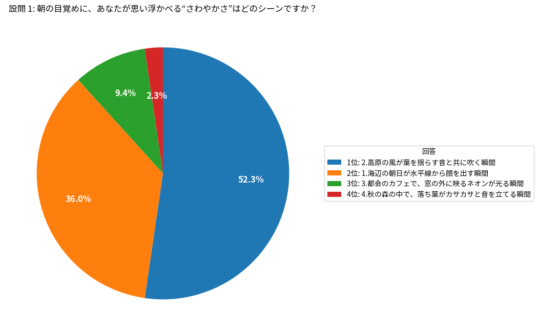
設問 2: コンビニで新しいスナックを選ぶとき、どのパッケージが最初に手に取られそうですか?
1: 淡いパステルカラーでシンプルなロゴが配置されたデザイン: 761
2: 鮮やかなネオンカラーとダイナミックなパターンが走るデザイン: 154
3: レトロなイラストと温かみのあるトーンでまとめられたデザイン: 49
4: 黒を基調にメタリックなアクセントが入ったモダンなデザイン: 36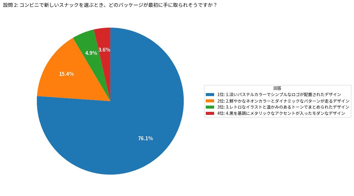
設問 3: 友達と週末に新しいお菓子をシェアするとしたら、どんなシチュエーションが一番楽しいですか?
1: 自然の中でハイキングやピクニックをしながら: 629
2: 屋外フェスやライブで音楽に合わせて: 62
3: カフェでゆっくりおしゃべりしながら: 147
4: 自宅でゲームや映画鑑賞をしながら: 162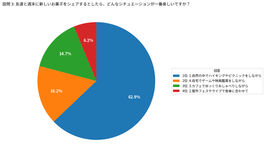
設問 4: テレビやSNSで有名人が商品を紹介しているとき、あなたが「信頼できる」と感じるのはどんな雰囲気ですか?
1: 自然体で笑いを交えたユーモラスな雰囲気: 2
2: 自分の経験や感情を率直に語る誠実さ: 346
3: 専門的な知識やスキルを活かした説得力: 652
4: 最新トレンドを先取りするクールさ: 0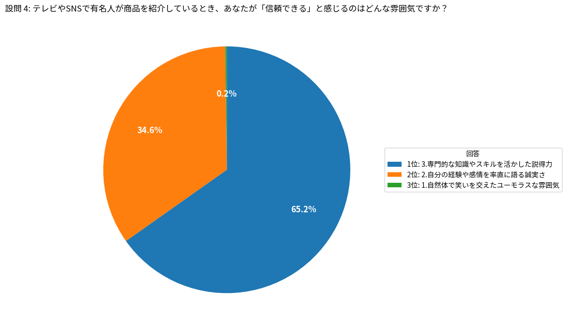
設問 5: 新しいスナックを食べるとき、どのような音楽が流れていると最もリラックスできますか?
1: 軽快なポップス: 4
2: リズミカルなヒップホップ: 5
3: 落ち着いたインディー・アコースティック: 874
4: エレガントなジャズやクラシック: 117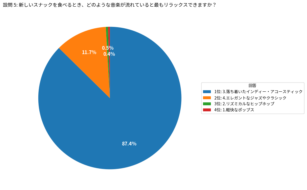
本話のまとめ
LLMが回答した結果をグラフで可視化する方法についてご紹介しました。さらに踏み込んで、人物の属性と回答の相関を調べることなどもできると想像しますが、それは、読者の皆様にお任せしたいと思います。
次話では、全体のまとめと、NVIDIA NeMo Data Designerのご紹介を行います。
お問い合わせはこちら